Performance Monitor
The Performance Monitor provides real-time visibility into your performance test as it runs — streaming live KPI cards, charts, and status distributions from cloud workers to your screen.
Accessing the Monitor
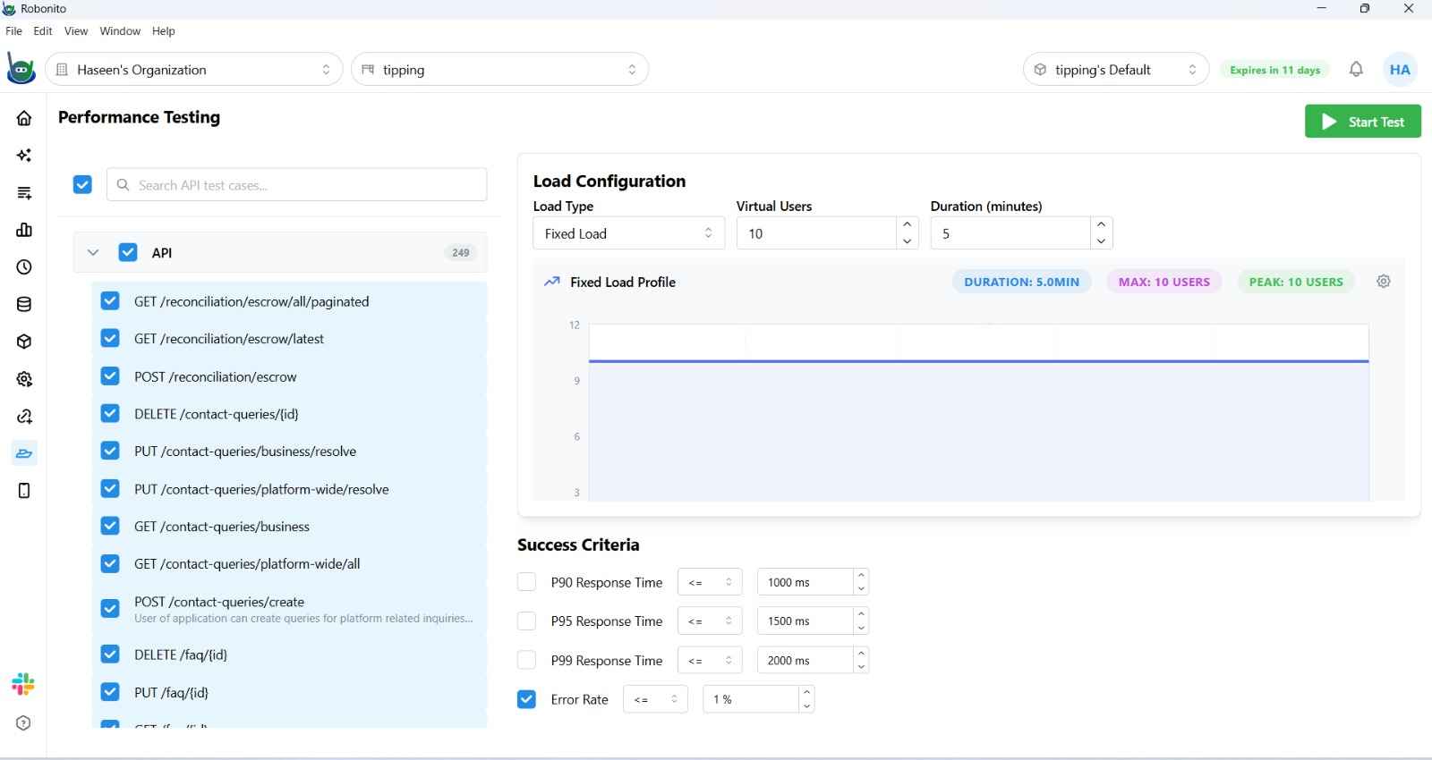
The monitor opens automatically when you start a performance test from the Performance configuration page. To configure and start a test:
- Navigate to Performance in the left sidebar.
- Select API test cases to include.
- Configure the Load Profile → (load type, virtual users, duration).
- Set Success Criteria (optional).
- Click Run.
The monitor opens immediately and begins streaming data as virtual users ramp up.
KPI Cards
Four real-time metric cards appear at the top of the monitor:
| Card | What It Shows |
|---|---|
| Total Requests | Cumulative request count + success percentage |
| Requests/Second | Current RPS + active virtual user count + active requests in flight |
| Error Rate | Current error percentage + total failed request count |
| Avg Latency | Rolling average latency in milliseconds + min/max range |
Cards update continuously as the test runs.
Charts
Virtual Users Over Time
A line chart showing how many virtual users are active at each moment. Reflects the load profile shape — ramp-up curves, spikes, and steady-state periods are all visible here.
Metrics / Percentiles Toggle
Click the Metrics / Percentiles tab to switch between two chart views:
Metrics view:
- Latency (ms) — average response time per second
- Requests/sec — throughput over time
- Error Rate (%) — error percentage per second
- Throughput KB/s — data transferred per second
Percentiles view:
- P50 — median latency (half of all requests are faster than this)
- P90 — 90th percentile latency
- P95 — 95th percentile latency
- P99 — 99th percentile latency (your worst-case users)

Status Code Distribution
A donut chart breaks down all responses by HTTP status code class:
| Color | Code Class | Meaning |
|---|---|---|
| Green | 2xx | Successful responses |
| Orange | 4xx | Client errors (bad requests, auth failures) |
| Red | 5xx | Server errors (crashes, timeouts) |
The legend shows the count for each class. A rising 5xx slice during a ramp-up typically indicates the server is hitting its capacity limit.
Controls
| Button | When Available | Action |
|---|---|---|
| Stop Test | While test is running | Immediately halts all virtual users and ends the test |
| Save Report | After test ends | Downloads a JSON file with the full test result data |
| Back to Configuration | After test ends | Returns to the Load Profile configuration page |
Success Criteria Results
If you configured Success Criteria (P90/P95/P99 thresholds or Error Rate limits), the monitor displays a verdict at the end of the test:
- Passed — all criteria met throughout the test duration
- Failed — at least one criterion was breached; the violating criterion is highlighted with the peak value recorded
Interpreting Results
Healthy test: Latency stays flat as VUs increase, error rate stays near 0%, P95 ≈ P50.
Approaching capacity: Latency begins rising with VU count, P95 diverges significantly from P50, slight error rate increase (1–5%).
System overload: Error rate spikes above 5–10%, P99 is 5× or more higher than P50, 5xx responses appear in the status distribution.
Use the percentile chart to identify which requests are slow — if P99 is very high but P50 is normal, a subset of requests (perhaps specific endpoints) are the bottleneck.